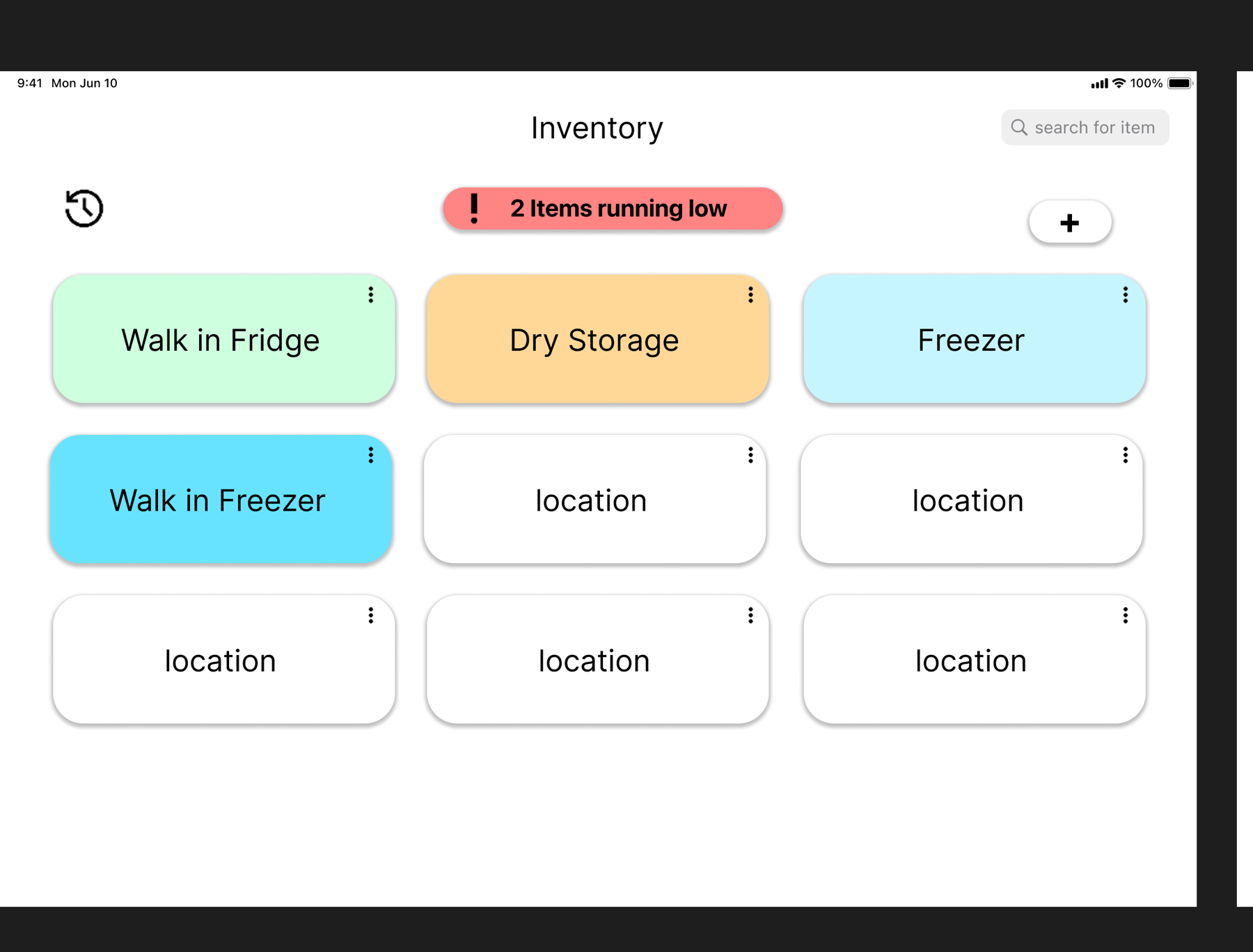
How much do we have, and where is it?
A restaurant’s stock count needs to answer more than “do we have fries?” Staff also need to know which freezer they’re in and how much is left there. A total across the whole restaurant doesn’t answer that question.
I worked with a five-person team on a restaurant inventory project, contributing to usability testing, analysis, and the redesign. We examined the spreadsheet workflow, then tested an app prototype on mobile and desktop. The tasks covered checking stock, correcting entries, adding deliveries, and deciding what to reorder.
Prep dates mattered too. Food prepared on different days needs separate records so staff can use older batches first. Combining those batches into one count makes the list shorter, but loses information people need on the job.
The spreadsheet showed us where people got stuck
We gave participants tasks and watched how they completed them. Searching for Peri Peri sauce and changing its quantity worked. Adding a newly prepared batch of Sriracha was harder: one participant took 2 minutes and 45 seconds to find the right sheet, copy a row, and recolor it to match the other entries.
Another participant found the Sweet Potato fries count in about 15 seconds, but couldn’t tell how the bags were split between the walk-in and kitchen freezers. The search was quick; the answer was still incomplete. That distinction mattered more than the time alone.
Restocking exposed a smaller layout problem. A red quantity cell helped identify an empty item, but it sat far from the item’s name. People had to trace across the row to connect the warning to the food.
Four sessions with the app prototype
The team then ran four sessions using restaurant role scenarios: a line cook checking a freezer, a prep cook correcting a date, a manager adding a delivery, and an owner reviewing low stock. Two team members handled each session—one gave instructions while the other took notes—and asked follow-up questions afterward.
The problems were specific. A participant looking for “Impossible Chicken Patties” encountered “Chicken Patties” in the list. Another corrected a prep date but received no visible confirmation. In the delivery task, the form accepted items without a storage location. The owner scenario required checking locations individually to work out what to order.
These observations pointed to clearer names, feedback after changes, and stock information that was easier to find. The team also flagged small mobile buttons as a design concern; that was not a measured result about one-handed use.
Put the warning beside the decision
We compared two changes in brief follow-up tasks. One added required-field markers and an error message to the new-item form. When the storage location was left blank, the message helped the participant catch it, though they still had to return to the field.
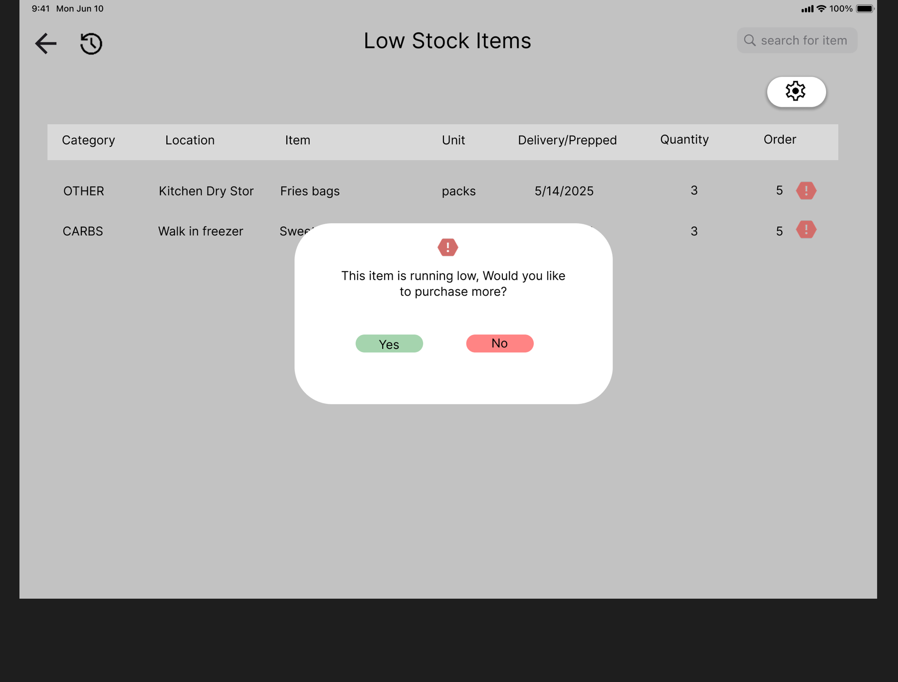
The other put low-stock icons directly beside items. In the restocking task, the participant noticed the alerts without opening another section. We chose that treatment for the final redesign because it removed a navigation step from a common task.
The final mockup also shows current quantities alongside order amounts, plus a confirmation prompt for replenishment. That keeps “how much is left?” close to “how much should I order?” rather than asking staff to remember one number while finding the other.
What the testing established
The strongest finding was that finding a number is not the same as getting a useful answer. A stock count needs a location; an edit needs confirmation; a warning needs to be close to its item. Those findings gave us concrete reasons for the changes.
The reports document task observations and a final mockup, not a controlled before-and-after study of restaurant performance. The times above describe individual spreadsheet tasks. They do not establish how much faster the finished design was.