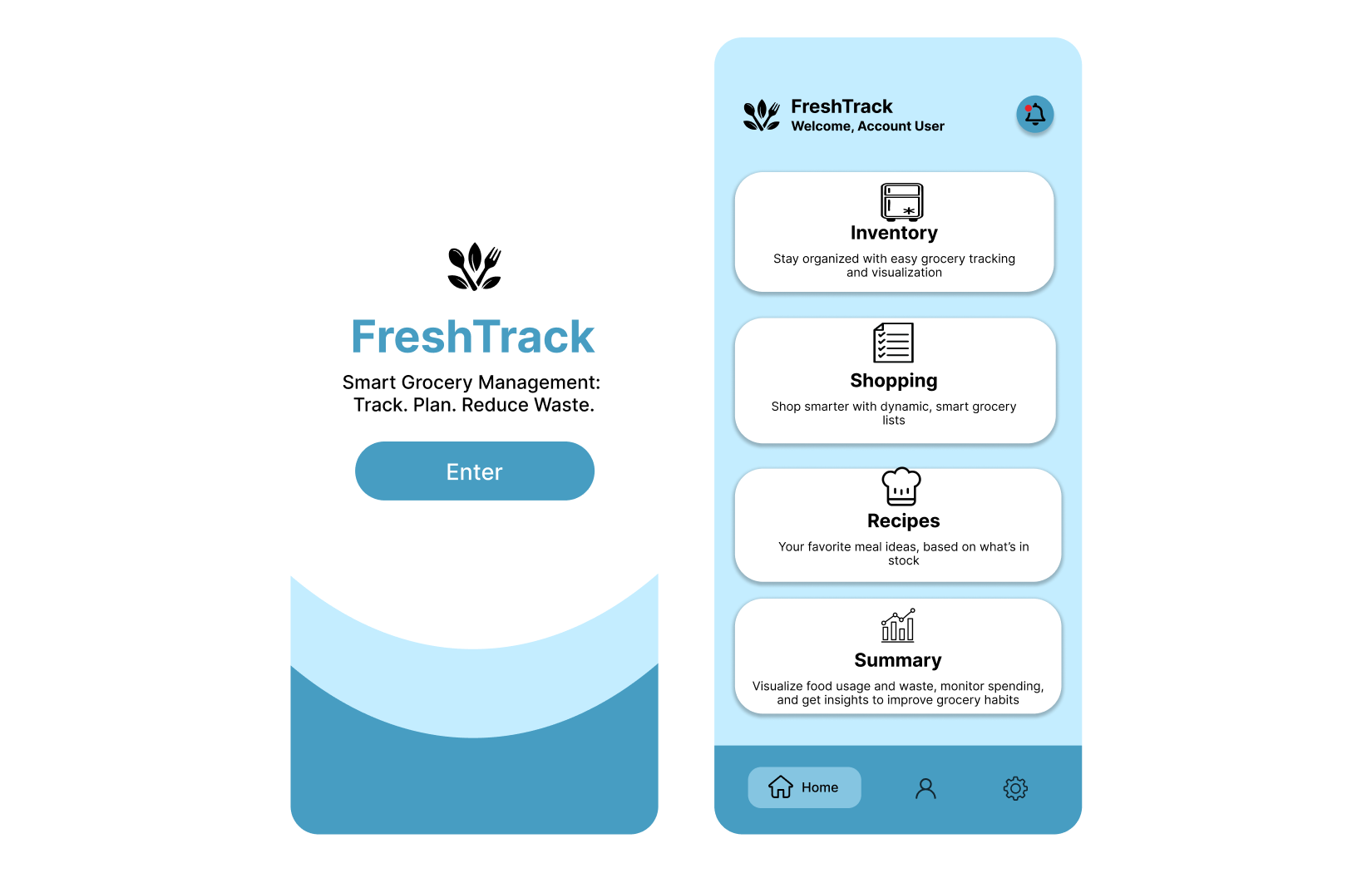
Overview
People lose track of what's in their kitchen. Some items
are bought in excess, others expire before they can be used, all of
which leads to unnecessary spending. FreshTrack sets a simple goal: know
what you have, plan what you’ll eat, and buy only what you need.
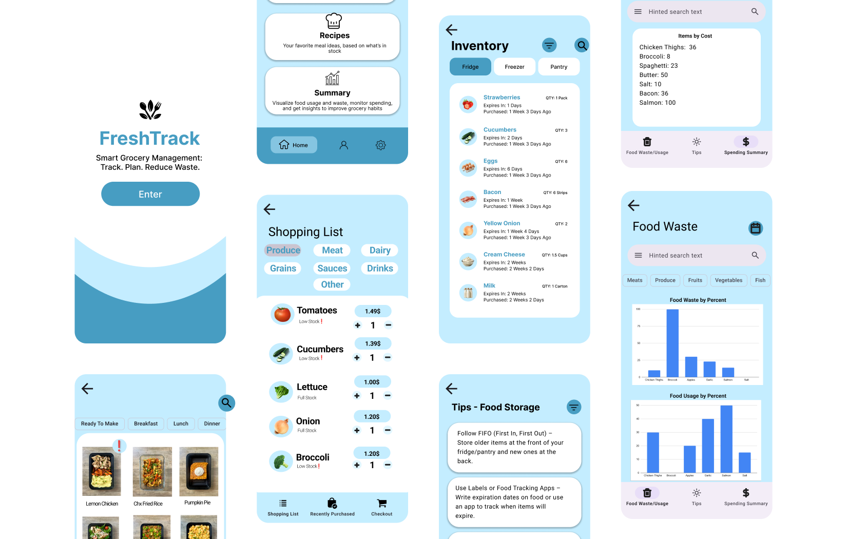
Design Process
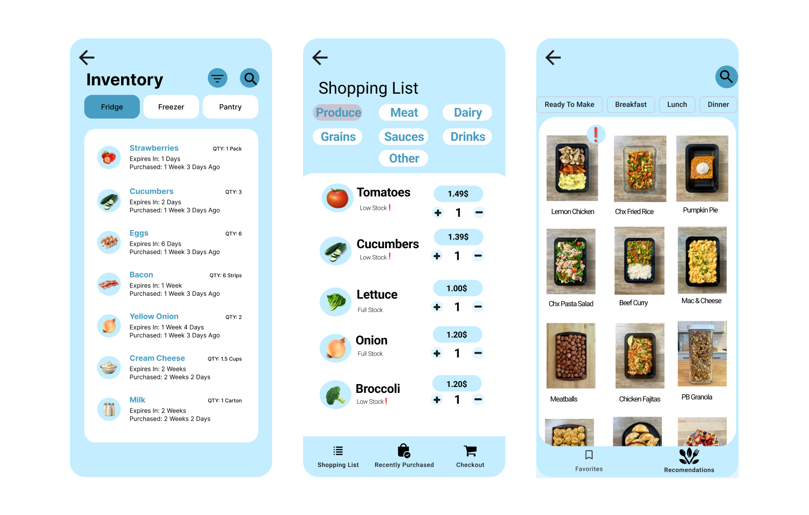
I mapped common grocery flows and designed three surfaces to support
them: Inventory, Shopping List, and Recipes, with a summary view for
feedback and trends. Decisions were guided by HCI principles: prioritize
critical info, recognition over recall, and feedback at every
step. In practice, that meant item expiration labels, purchase
suggestions, and recipes using items already on-hand. The result is a
system that lowers cognitive load and bridges the gap between what
users want to do and what the UI affords.
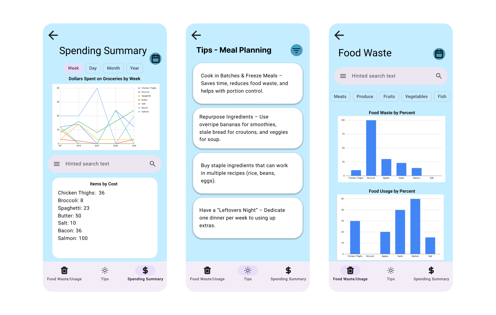
Results
Early walkthroughs showed that navigation felt natural and the
“what should I buy?” question got easier once the inventory was linked
to the recipes and shopping list. The Summary tab then shows spending
and waste trends so habits can adjust over time.